The Return of the Windows Phone
Microsoft is finally back in the modern Smartphone game

This week has seen the annual Mobile World Congress take place in Barcelona. MWC is THE place where mobile device manufactures come to show off their latest wares and where journalists flock to attempt to chart what we can all expect for the mobile year.
This year Microsoft stole the show with what can only be described as a mobile resurgence with Windows Phone 7. OK, so Windows Mobile/Phone 6 and 6.5 run quite a lot of phones out there, but it's been a dead duck for the last two years. With competition from Android, the iPhone, the ever-present RIM and Palm's webOS, it was about time Microsoft brought themselves into the modern smartphone game.
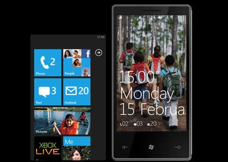
Windows Phone 7 series represents a serious paradigm shift from Microsoft. Not only is it based on Windows CE6, like the Zune HD, but they've completely rewritten their UI playbook. Gone is the reliance of a stylus to get things done, the humble finger reigns supreme as it should. Infact Windows Phone 7 is so drastically different from it's predecessors and any other phone operating system out there at the moment it's pretty hard to describe.
Microsoft calls it's interface 'Metro' and it is essentially like a Zune interface blown up and extended. Drawing more from it's Zune and Media Centre experience than Windows, Metro is heavily reliant on motion and typographic elements forged in a high contrast, minimalist UI. Gone is any degree of alpha shading, bevels or modern accents that Apple and co, insist on splashing everything with. That's not to say Microsoft's 'chromeless' design lacks polish, but it's a simplified plain interface that really suits the small screen.
The Start screen holds rows of tiles down the middle which are live and animated with ones that are used more often promoted to the top. The list of tiles can be infinitely long and scrolled down with a swipe. Status updates and things like that can be pushed to the tile allowing you to see them at a glance of the animation.
Microsoft has also fleshed out the 'hub', something that will be familiar to Zune HD users. Hubs offer a middle ground between icons and a full blown application. A hub is an extension of the OS which can carry content in from both local or cloud sources, meaning photo galleries can be browsed right from a hub. Think of them as a way to pull information into the OS without having to have a separate app running. Microsoft showed off a variety of hubs at MWC2010 including a People hub which pulls in contact information and status updates from social networks, contact databases such as Gmail's contacts and of course Exchange. The smart thing about the hub is that the first screen you see is a dynamically generated screen with the people you contact most right in front of you and a section for 'Me' which allows you to update you status across multiple networks. Other hubs featured included Games with Xbox Live support, the Marketplace, aka App Store, Music and Video for all your media, Pictures, Office and the usual calendar, messages, email, phone, Bing Maps and Search, and of course IE mobile.
An impressive turn around for Microsoft indeed but how it actually performs in the hand remains to be seen. I for one am excited to see Microsoft back in the game, it's been a while.


