Gaming in reverse - Quake
Omar Hafeez-Bore on why old games get better when you pretend they’re new

So here’s my plan, to get my own back on the remakes. By actually going back. As in, back-WARDS in time! Yes, I’m going to use the power of artistic licence to reverse time, and see what pixelated gems of gaming goodness have been lost along the way.
What has pushed me to this drastic plan of action? I mean who could argue with taking those hazy childhood memories of gaming, and sprucing them up to preen and perform for modern gamers?
Who could argue with dispatching a new group of gamers to fell Shadow of the Colossus’ titular titans, and feel the guilt afterwards? Or with recruiting new thumbs to pilot an Arwing in Starfox 64 3D, listening to the radio-chatter hubbub of gaming’s most iconic sound bites?
“I guess I should be thankful!”
And I guess I should be especially thankful for the super-effective, special attack justification for this remake craze: who could argue with a new set of men becoming boys again, and taking those daunting baby-steps into the expanse of Hyrule Field in Ocarina of Time 3D?
Well at first, I did. I wasn’t arguing against the rushed attempts of some publishers to milk whatever cash cow franchise they owned. After seeing the trailers, I actually had a specific, personal gripe with Ocarina of Time and its much touted visual spit-and-polish.
I mean, did you see the new trees in Kokiri Forest?! All individually rendered in loving detail? What the hell had happened to the low-res, is-that-seriously-meant-to-be-a-tree trees that used to surround the forest? Their endlessly repeating texture of vaguely wood-y colours suggested deep forest more than any amount of crafted polygons ever could. And don’t get me started on the hyper-warm colours in the trailers.
Too late! You just did with your revolting look of confusion.
Seriously, what were those new Hyper-warm colours? Was this Hyrule-Del-Sol or something? Where was my earthy-toned, muddy Hyrule, and what was this flashy imposter with its cheap greens and golden hues?!
So the trailers got me worked up. And thinking. And what I thought was: By Golly! (because that is how thoughts think) there are a lot of types of remake, and most are very good, but maybe some of them lose something in translation. Even more interesting (By Golly Gosh!) was the idea that maybe, sometimes, there were some stylistic advantages to the old limitations on graphic and sound.
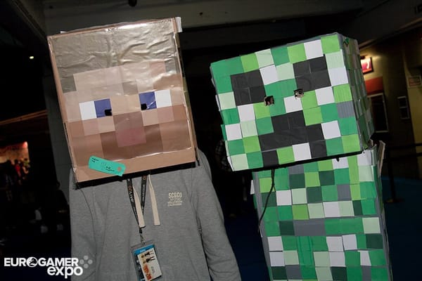
Think about it (What ho!): what was originally a necessity, of using pixelated graphics and 8-bit chip-tunes, has now been embraced as part of the gaming aesthetic. Many games, from Minecraft to Megaman 9, relish the unique power of using pixels as their brush strokes or blips and bleeps as their soundtrack.
So is shinier and spanglier always better? This being Imperial, we must experiment. As I mentioned earlier, I will use the power of writing to REVERSE TIME ITSELF.
By doing this I will (single-handedly) transform the gaming landscape from one endlessly striving towards realism and simulation, to one that starts off realistic and suddenly embraces the abstract. The slowdown, the short draw-distances and square polygons. We’ll pretend it’s like fine art, starting off all obsessed with fabrics and shadows and portraits and landscapes, before being forced by photography into a kaleidoscope of creativity. Surrealism, impressionism, and all those other-isms.
We’ll pretend, just as a null hypothesis type thing, that even if Miyamoto had the choice of 3D-high-resolution, bump-mapped, bloom-lit powers when he invented Mario, or Toby Gard had the access to performance-capture, anti-aliasing, motion-controlled know-how when he made Tomb Raider, that they’d still choose to make them just as they did.
I hope to choose a game or two every week, often ones that’ve since been remade or refined, and see if any of its retro chic can beat any of our modern shine.
Let’s reverse time and see what we find!
Since id’s success with Quake 4, it has produced 3 sequels including the trigger-happy Quake 3, and a true strogg-and-sci-fi sequel Quake 2. But it’s in its latest incarnation (trendily called just ‘Quake’) that the series has found the eeriness and atmosphere it has always strived for. id has eschewed the steel walls and electric doors of Quake 4 and its sequel too, instead opting for a uniquely baroque hybrid of gothic architecture, thunderous guns and grotesque fantasy monstrosities.
Its masterstroke of horror however is in reducing the amount of frames of animation used. Instead of the fluid and familiar advances of Quake 4’s enemies, the ones in Quake are rendered with a jerky, staccato energy, as if fighting in strobe lighting. Funny as it may sound, it actually gives the gunplay a brutal immediacy of impact, and the already ghoulish designs the unnerving, alien rhythm of a Ray Harryhausen stop motion effect.
“The enemies in Quake are rendered with a jerky, staccato energy, as if fighting in strobe lighting”
There is nothing as tense as seeing one of Quake’s huge Shamblers crashing across a hallway in juddered strides, nothing as vicious as a possessed knight swinging his sword in the few frames of his frenzied swing, and nothing better as message from id to the rest of the FPS competition; that in this day of motion-capture and self-indulgent animations, less can still be more.


