Kindling dissatisfaction
Feroz Salam finds the Kindle Store massively unintuitive

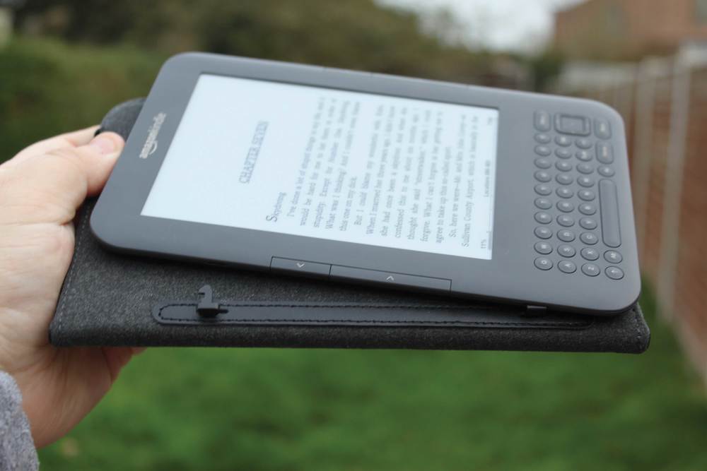
I was one of the 1.2 million adults in Britain gifted an Amazon Kindle this Christmas, and as far as presents go it’s probably my favourite so far. Using the device has been a dream, and it has made the 20 hours I spent stuck flying in economy class this winter many magnitudes more enjoyable. There is much to praise about the Kindle, and most of it has been said already. The price speaks for itself, the device is solid and the ability to pick up newspapers and magazines from publishers across the world (delivered daily to your bedside table, no less) makes it a unique pick in a field of lookalikes.
Setting the positive device reviews aside for a moment, I would like to focus on something that not many technology reviews have dealt with. Understandably, most reviewers have centred their pieces around the device itself and the software that runs on it. What this excludes, however, is a discussion on how the Kindle Store works. It’s where I find the Kindle experience fails miserably. For the uninitiated, the Kindle Store is where all the magic of buying those books/newspapers/magazines actually happens. Or where it’s supposed to happen.
Struggling to spend
What I find is that the Kindle Store (both online and on-device) is really very poor at getting you to books that you want to read. After having unpacked my Kindle, I set about looking around the store to buy a few books for my flight the next day. When you reach the home page of the store you are met with three options for choosing books: browsing the entire library, choosing from a featured selection or picking up a recommended book.
Browsing the entire library, as you would expect, is a mammoth task. Small as the Kindle library is at the moment, hundreds of thousands of books lie in wait, and Amazon does little to ease the pain of searching through them. Clicking on this option leads you to a list of major genres. Clicking on a genre leads you to a list of books, ordered by sales (you can also order by rating, and possibly by price). I don’t know how many bibliophiles read the Technology section each week, but if you have any experience buying books you’ll see why this is really very poor. Aside from buying science fiction, I have never gone into a bookshop with a specific genre in mind (‘Ooh, I’m feeling like some alternative historical romance this week’), and I don’t focus very much on bestseller lists. Sorting books by rating doesn’t help me identify books I want either: Heston’s Fantastical Feasts might be well appreciated by cookery nuts but I’m really not in the market for that sort of non-fiction. Sorting by price, and we’re getting just a little bit silly.
“Amazon does little to ease the pain of searching through them”
Those who head to the editors’ picks for good content are better off, but only very slightly. The recommendations are good, but are usually fairly major books that you’ll find recommended by other website and reviews. There aren’t that many of them either, and if you’re looking for something better than the browse feature to dive into Amazon’s library, this isn’t one of them.
The Recommended Books section fares the best, but it’s still not a great effort. Buying some Kurt Vonnegut has crowded my recommendations section with all of his books, along with a scattering of bestsellers. Assuming that because I read one book by an author I am similarly interested in all his books is a charmingly deluded notion. It also introduces me to precious little in the way of new authors and books; surely in the age of Google I don’t need to be pushed into staring at the bibliography of an author I am already aware of?
Finding solutions
If the store experience is so dire, where can Amazon improve? I think one good (and basic) step would be to include plot summaries of books on the results pages. The status quo, a list of titles, star ratings and book covers is almost entirely uninformative. Overall, however, the browsing experience needs to be revamped. You need to be presented with more books on every page, books that aren’t surgically sectioned away into neat categories. A virtual bookshelf would be nice, where you could see the spine/front cover of every book and a small plot summary popup when you hover over a specific book. Recommendations need to be completely revamped, in a way that applies to all of Amazon’s services (on a related note, I am not enamored of the fact that buying one USB cable has meant Amazon assuming I am in some sort of computer-cabling mafia).
The problems all stem from one central theme: Amazon is not Google, but is acting as if it is. The book with the most number of ‘hits’ doesn’t mean I’m more likely to read it. Being able to sort by a wide variety of options doesn’t improve my purchasing experience. What the Kindle Store is forcing me to do is look up books in real life and head to Amazon to buy them when I get home, simply because browsing on the Kindle is a mess. If the Kindle Store is meant to be a alternative to your brick-and-mortar retailer (as the Amazon marketing shtick would suggest), it’s doing a massive disservice to a vast user base.


