Windows' latest OS: Windows 8 - A verdict
Stephen Ingram tells us his thoughts of Microsoft’s latest OS

With the next version of Windows, 8, Microsoft are going completely overhaul the interface, with many people wondering whether ‘the average user’ will be able to adjust to the change (search ‘Dad tries Windows 8’ on YouTube for some examples). The main change implemented is that the traditional desktop is now merely an app inside another interface called ‘Modern UI’ (formerly known as “Metro”, but following a trademark dispute with German Metro AG, Microsoft dropped the name). It’s the same user interface and graphical toolkit currently used by Windows Phone 7 (and soon 8) devices. This is an attempt to unify the ‘face of Windows’ across desktop, mobile, and tablet.
Having tried the Windows 8 release preview on a dusty old tower at home, I found that, while it is nowhere near as efficient at doing certain tasks as Windows XP or many Linux distributions, many of my concerns about usinga jack-of-all-trades interface were unfounded.
Productivity Anyone who has attempted to engage in serious office or design work on a smartphone or tablet would agree that such devices are not designed with this in mind, and it is often said that they are purely consumption devices (although the term consumption in the context of software is somewhat erroneous, since digital media are not consumed when you watch/listen to/play them, but the sentiment is still mostly accurate). The main reasons for this are the form factor (but using Windows 8 on a desktop renders this irrelevant, and Microsoft seems to be keen for its tablets to have Bluetooth keyboards) and lack of simultaneous multitasking. The latter problem is addressed somewhat as you can use multiple apps at once via a split screen effect, although it seems that outside of what’s on the screen all other tasks are frozen.
File Management However, another, more integral problem hampers work on mobile operating systems: most information you experience is not comparable to a file in the desktop OS sense. While you can get file manager apps for mobile devices, the issue is that when any two apps need to share information, it must be done through interoperability between the apps, built from the ground up, rather than simply integrating with the files saved on the device. This leads to either bloated (resource hog) apps that try to reinvent the wheel, or apps that are specialised yet can hardly function outside of a small set of tasks.
Windows 8 does not suffer from these problems, as it retains the traditional file explorer that can be run in the desktop mode, which all applications seem to interface with. Obviously, we will have to wait and see the extent to which third party apps keep this up, but it seems unlikely developers would go out of the way to give themselves more work in this way.
Accessibility Over the summer I volunteered in a library providing tech support, often to older people with little experience of the motifs of desktop computing. One of their main sources of confusion, and I would imagine anyone who has helped technophobes would agree, was what, precisely, an application is. The idea of a program that is separate from a) the operating system it runs on, b) the window that contains it, and c) the content that is produced/relayed through it is an extremely difficult concept to understand.
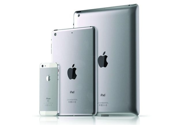
In light of this, I found it odd that so many of us buy smartphones (51% of brits now own them), devices whose entire selling point (‘there’s an app for that!’) seems to be this concept. In my opinion, this is because apps are not applications for the computer in the original sense but another product that owning the device allows you to buy, often from the device vendor themselves. This is a much easier concept to get your head around and a very simple way to monetise a mobile operating system. Some examples of this include the Kindle Fire and Nexus 7 tablets, which almost certainly sell at a loss, but whose profits are made up by subscription services offered by Google and Amazon. The reason that I mention this is that Microsoft fortunately does not seem to be going down this route with Windows 8. The model that they are pushing to sell their own software puts more emphasis on useful work and noton providing every aspect of your life and entertainment, like Apple or Google. This is fortunate because such software services tend to collect your personal information and provide their media under very restrictive Digital Rights Management.
Interface Consistency This has been written about in some detail on the website osnews.com but I think it is relevant to Windows 8 and quite prescient considering how just about every OS is altering its user experience to become more ‘mobile-like’.
When you’re using an app on a smartphone, the percentage of the screen taken up by the OS is almost always smaller than on a desktop, and you hardly ever see more than one app open on the screen at the same time. As a result, many apps can sacrifice fitting in visually in a way that desktop applications cannot (the number of android apps that completely follow Google’s ‘Holo’ guidelines is surprisingly small).
I can’t talk about how easy the graphical toolkit is to develop for, but, with Windows Phone 7, Microsoft are extremely strict about which applications are let into its marketplaces, and hopefully this will help alleviate the issue of visual inconsistency in Windows 8 (and some other causes such as simply porting an iOS application or coding your app in HTML).
Conclusion I have absolutely no doubt that many people will find Windows 8 much harder to use and to get used to using than previous versions. I have every doubt that it will lead computing in a more efficient and interconnected direction, but to my surprise, many of the practical issues the tech community (and myself) have with using a mobile interface on a non-mobile device seem to have been addressed. Essentially, Microsoft has converged two paradigms in such a way that the end product is inefficient on either device and will almost definitely ostracise large portions of its user base. But it’s done it in style.


