Return to paper?
First thoughts on Facebook's new app

Yes, Facebook, has turned 10. Ten years this giant has been sucking out our souls, killing our times and generally trying to inject itself into every aspect of our lives. Now they have introduced their next strategy in their multi-pronged attack to make themselves virtually indispensible, a reader app named paper. Almost identical to Flipboard, it aims to deliver a new experience to browsing Facebook, and general news around the Internet.
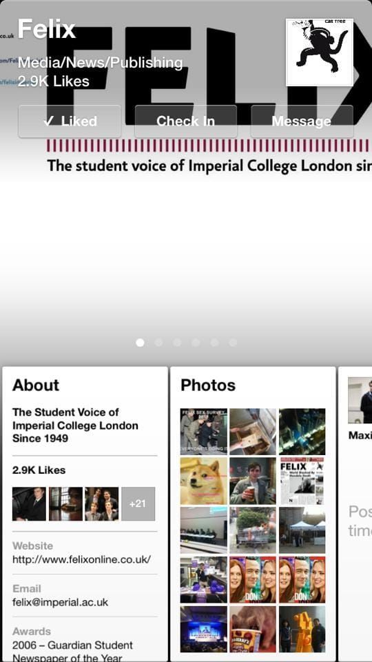
The quote I first read when I read about Paper was “This would be Facebook if it had been first created in 2014”. I cannot agree more. Doing away with the blue and somewhat out-dated style of the website and application, it replaces everything with individuals little stories on the bottom with one randomly selected story filling up the background. Furthermore this format is replicated throughout the entire app, e.g. Headlines, News etc. All in all everything looks really futuristic and smooth.
In terms of actual Facebook use, it tends to everything quite well. Messages and notifications are almost the same (although the double notification of both the normal Facebook app and then paper did annoy me to the point that I did have to turn it off). You can post statuses, like and comment things etc. Furthermore the Facebook profiles just look really great.
This app was billed as the death of the old Facebook app and looking at it I can understand why the bloggers of the Internet predict this. However for now I just believe it is too different, feels like it is lacking to many features to be a real killer. It does show that Facebook is ready to change things up and stay current, also it is a good alternative when you are too tired of seeing blue all the time though.


