From the Renaissance to the Modern
Fred Fyles finds common ground between two very different shows

The end of last month saw the opening of two exhibitions that delve into the world of art history and theory, taking a critical look at the development, continuation, and deconstruction of certain techniques within the art world. At first glance, the two couldn’t seem more different, one dealing with renaissance drawings and the other focussed on modern photography. But scratch beneath the surface, and they actually share many things in common: an appreciation of the production of images, an exploration of their forms’ respective pasts, and an emphasis on the importance of context within the fine arts.
Firstly we have Renaissance Modern, a collection of 16th Century drawings and prints selected from The Courtauld Gallery’s collection; on display in their new Gilbert and Ildiko Butler Drawings Gallery, an oasis of warm-wooded calm amongst the Neoclassicist confines of the main gallery, the exhibition takes a look at how the renaissance idea of ‘modern’ was formed. A series of engravings and drawn works form a visual essay on the history of the era, during which critical thinking about the past began to truly interact with the artistic world, setting the path the art world would follow until Futurism tried to free it from historical bondage.
Certain themes crop up in the display, showing us what modernism meant to the Flemish, French, and Italian artists featured. Collaboration was a key development; the use of prints meant that visual ideas could be disseminated easily across the continent. For example, Hendrick Goltzius’ engraving of Spring is used by another artist for their own work, in which they add floral garlands to Spring’s body, emphasising his androgyny. The gallery is set up so that these images follow one another, giving us an immediate context for the image.
But scratch beneath the surface and they actually share many things in common
Elsewhere, there is evidence of an increased focus on narrative value, with painters and artists mining the rich seam of European liturgical imagery for their allegorical works. Details took on a new importance, helping to convey the message of the artist. Thus, Martin van Heemskerck’s drawing of Magdalen washing Christ’s feet features Romanic architecture, further blurring the line between modern and ancient. Elsewhere, artists turn to ancient tales like Ovid for their inspiration. Technological developments get a nod, such as in Barocci’s study of Christ’s circumcision, which features new coloured chalks, but on the whole the collection works as a paean to the importance of line drawings. Nowhere is this more evident than Luca Cambiaso’s wonderfully thrilling drawing of a cavalry battle; composed of mere lines and squiggles, it manages to convey the fury and speed of warfare with a skill that would be unmatched until Giacomo Balla.
While many of the works were composed as studies for larger oil paintings, the quiet, unassuming nature of the gallery allows us to fully enjoy these small drawings, inviting us to revel in their intimacy.
East London’s Whitechapel Gallery hosts the next exhibition, and the environs couldn’t be more different. Their latest exhibition, Christopher Williams: The Production Line of Happiness, replaces their summer extravaganza Adventures of the Black Square, but upon entering the space, it immediately appears that they’ve forgotten to clean up. Captions for the previous exhibition remain on the walls, and the introduction to_ Black Square_ is still there, bisected by a large swathe of green paper. However, this is all part of the master plan of the exhibition, billed as “an essay in photographs, printed matter, dialogue, and walls”. The third in a line of exhibitions (previous ones were held in Chicago and New York), _The Production Line of Happiness _forms a wide-ranging retrospective of this little-known American photographer.
Williams’ work is rich with context but the lack of explanation can mean that most flies over your head
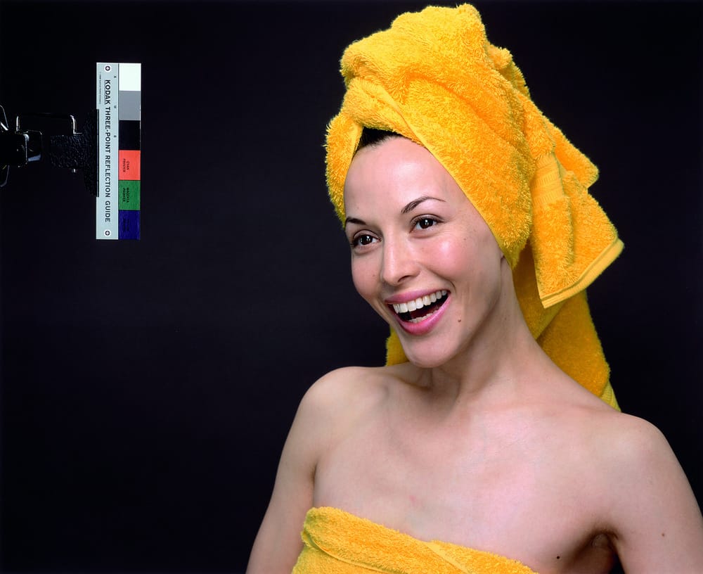
Taking inspiration from glossy advertisements and the language of the magazine image, William’s work has a clear, non-expressionistic quality, that makes it particularly suited for close-viewing. He has stated that the ideas of his work can be found in “everyday culture, the news kiosk”, and this is only emphasised by the collection of images on display; we close the show with a series of images taken at a Japanese photoshoot for a fashion magazine – Williams went along, having been given the technical specifications and nothing else, to produce work that was intentionally different to the magazine’s work. What could be a picture to be published in the corner of the page, to be flipped over without a second glance, enters into a gallery space, and – with its low hanging – invites us to consider what is meant by art.
Williams is obsessed with the technicalities of photography, resulting in images that can serve as cryptic messages on the state of the camera. His technically precise image of a dishwasher, for example, which required painstaking set-up to prevent colour bleeding, takes its colour theme from that of the Alfa Color film brand. Elsewhere, he takes a 1968 Renault, and restages a scene from the Paris uprising, minus the people and the chaos. Instead we have a contemplative shot of the car on its side, its naturalistic lighting belying its technical complexity – it’s his take on Edward Weston.
Those of you who are by this point rolling your eyes, bored of phrases like ‘institutional critique’ and ‘redundancy as a field of freedom’, might have a point. Williams’ work is rich in message, positively overflowing with context, but the lack of explanatory material (Williams’ work often has titles detailing all the technical specifications, making them too long to be printed – yet another layer!) means that most of the work can fly over your head, coming across as self-indulgent. I would argue that you should give this exhibition a chance; there is an accompanying publication which, if your bank balance can handle a hit, is likely to prove illuminating. There is magic within the work, but it requires an effort on the part of the viewer.


