Hail to the Prints
An election season special looking at campaign posters through the years
One may ask ‘What has art got to do with voting for the lesser of two evils?’. Yet, there is a spoken half-truth in the arts section that it usually has everything to do with everything. Elections are not simply about displays of hard power such as seen in manifestos, debates, and the occasional caucus, but also displays of soft power: campaign adverts, jingles, slogans, and artful posters.
Election posters, or the occasional cartoon, have been pivotal in displaying candidates to the general populace. In the time of Washington and Adams, most of the public would not have even been able to put a candidate’s name to a face, or generally have been able to read for what they stand for at all. A poster, however, with subtle (or in America’s case, not so subtle) imagery can effectively convey a message more clearly than any promotional pamphlet could ever hope to achieve to the illiterate. Therefore, this article displays and eloquently walks through a selection of promotional material candidates have stuck on the local community walls over the years. In true arts section style, we are bound to candour.
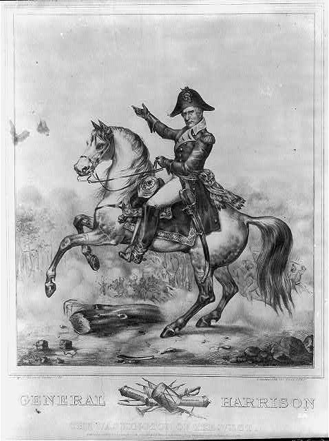
William Henry Harrison was, by any mark, the shortest-lived president in US history, only surviving in office for a period of one month before dying exactly one month after taking the oath. However, his poster speaks volumes, long outliving a mere month. Firstly, it is evident to see that he is a man of high military stature; as the last President elect to have initially been a British Subject, his poster reflects the ‘American Triumph’, although now it looks more like he is about to lead a fateful crossing of the Alps. What the observant viewer may also notice is the bundle of military items at the bottom of the poster, reminiscent of ‘the fasces’, a symbol of unity and community at the time - this symbol would become defunct after the 1930s due to connotations with fascist imagery. It is very clear what Harrison would have done as president if his immune system was not tired of batting pneumonia: continue to promote freedom to all the ‘American way’ - with large scale military conquest.
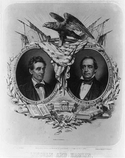
One theme one can notice with a lot of presidential campaign posters is the ‘dual portrait’ of both president and vice-predential hopefuls. While it may seem obvious nowadays, it is important to know that a frequent number of presidents before had been military men who had fought for the States. Their career had been solidified quite easily and the art required to promote them (full military dress, heroic posing) was fairly easy to capture. In the case of lawyer and desk jockey Abraham Lincoln, capturing his patriotic tendencies was trickier. Instead, his campaign poster attempts to speak to another American ideal: equality before God. Both the president and vice-president are on a level footing with each other, offering the idea that both men are equals. This is consolidated with details of both a book of the law, and the book of God, cementing the idea that these men intend to abide, represent, and solidify the law of both the human and the divine.
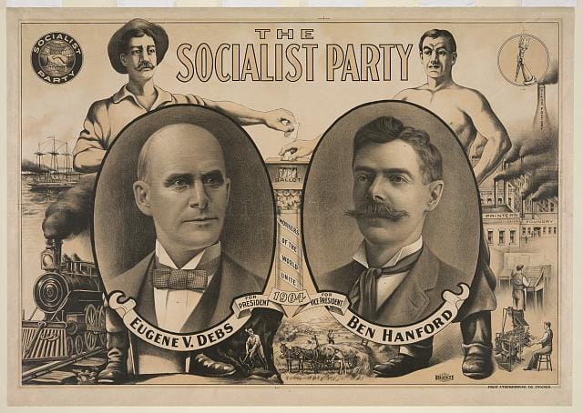
People oftentimes forget that before 1919, America did in fact have a socialist party. This poster retains the classic ‘dual portrait’ that many candidates had before them. However, this time, the classic American images of God, the constitution, or even the olive branch of peace, are now absent. Instead, this poster reveals a great deal about what was on the American political agenda at the time: railway expansion, industrialisation, the now prevalent economic divide between the working and middle classes, and also the cultural divide between America’s rural communities in the territories and the industrial heartlands of the east coast. While Debs was very unsuccessful in his campaign (perhaps because Hanford had stolen all his hair), this poster does give us a better glimpse into the cultural upheaval America was experiencing at the time. The age of reconstruction was over, and the age of progress emulated by the gilded age, had begun.
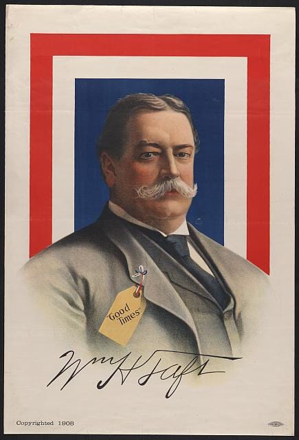
Here we have heavy-weight US president William Taft portrayed as a man offering ‘Good Times’. At this point the Republican Party was riding on the wave of popularity set out by T. Roosevelt, and as such you can clearly see that they just could not be bothered to come up with any decent imagery for the man of rather large stature other than the fact he is offering prostitution services, it seems. This is a truly dull poster with none of the theatrics we came to appreciate from the Republican party. Yet, as we shall see, there are worse.
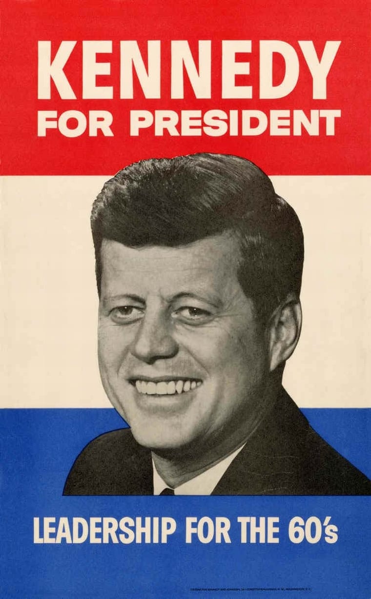
The Kennedy campaign pooled all their resources from their mafia connections to present this poster. It noticeably and visually brought a shift in terms of presidential posters’ graphic design. The young, trendy socialite looks like he could even seem happy to run for the job, unlike his predecessors. Not only that, but we start to see the emergence of a new form of power posing - the wistful look. This poster screams of optimism, but in the subtle tones. It marks the shift of the Democrat party from ‘Gun-toting, freedom loving, stetson wearing’ policies to the more ‘East-Coast Liberal’ approach that we have come to associate with the party today. It is little wonder that his opponent Richard Nixon, famously known for having a face for radio, lost the campaign.
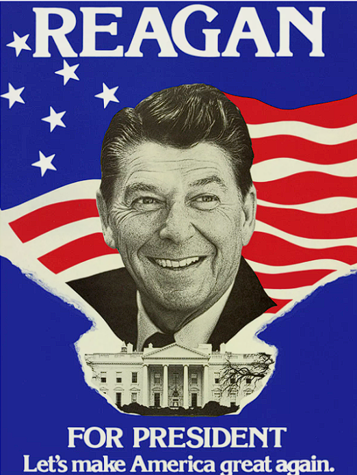
This is Ronald Regan. You may remember him for such films as ‘Bedtime for Bonzo’ and ‘Knute Rockne All American’. For those who do not, you may remember him as the messiah of American conservative politics, whose book of revelations is still referenced by Republicans to this day. Despite having one of the most successful campaigns of any president, this poster is truly a travesty to man. The flag looks like it was terribly rendered in MS paint and someone turned off the gravity: the stripes crop terribly around his head, and, as a pastiche to his film days, he looks like he is bursting through the poster in a nod to Jack Nicholson in ‘The Shining’. His looming presence over the White House is undoubtedly what gave Roland Emerich the idea to make the iconic flying saucer scene in ‘Independence Day’. The poster itself is one of the worst conjured. However, what captures the average voter is the now familiarly plagiarised slogans, ‘Let’s make America great again.’
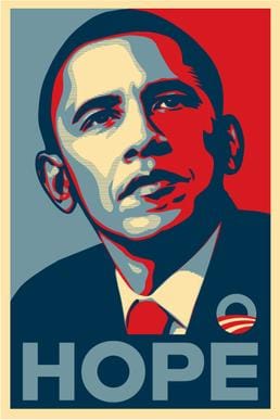
This poster needs no notes, it is the perfect poster - it is so perfect it even has its own Wikipedia article. Designed by artist Shepard Fairey in his classic two tone style, this poster captures everything that Obama and the Democrat party wanted it to convey: the wistful look, the catchy slogan, and the serious politician. This is the image the Democrat party wanted to conjure in one sublime image. But what don’t you see on this poster? You do not see words like ‘For President’, ‘Vote’, and you don’t even see Obama’s own name! But that is part of why this poster is brilliant: it shouts ‘This man is bringing hope, change, and progress’, without spelling it out phonetically. Not only that, but this is a poster that does not treat the public like idiots. You know you can vote, you know who this man is, and you know for what he stands. What else is there to be said?
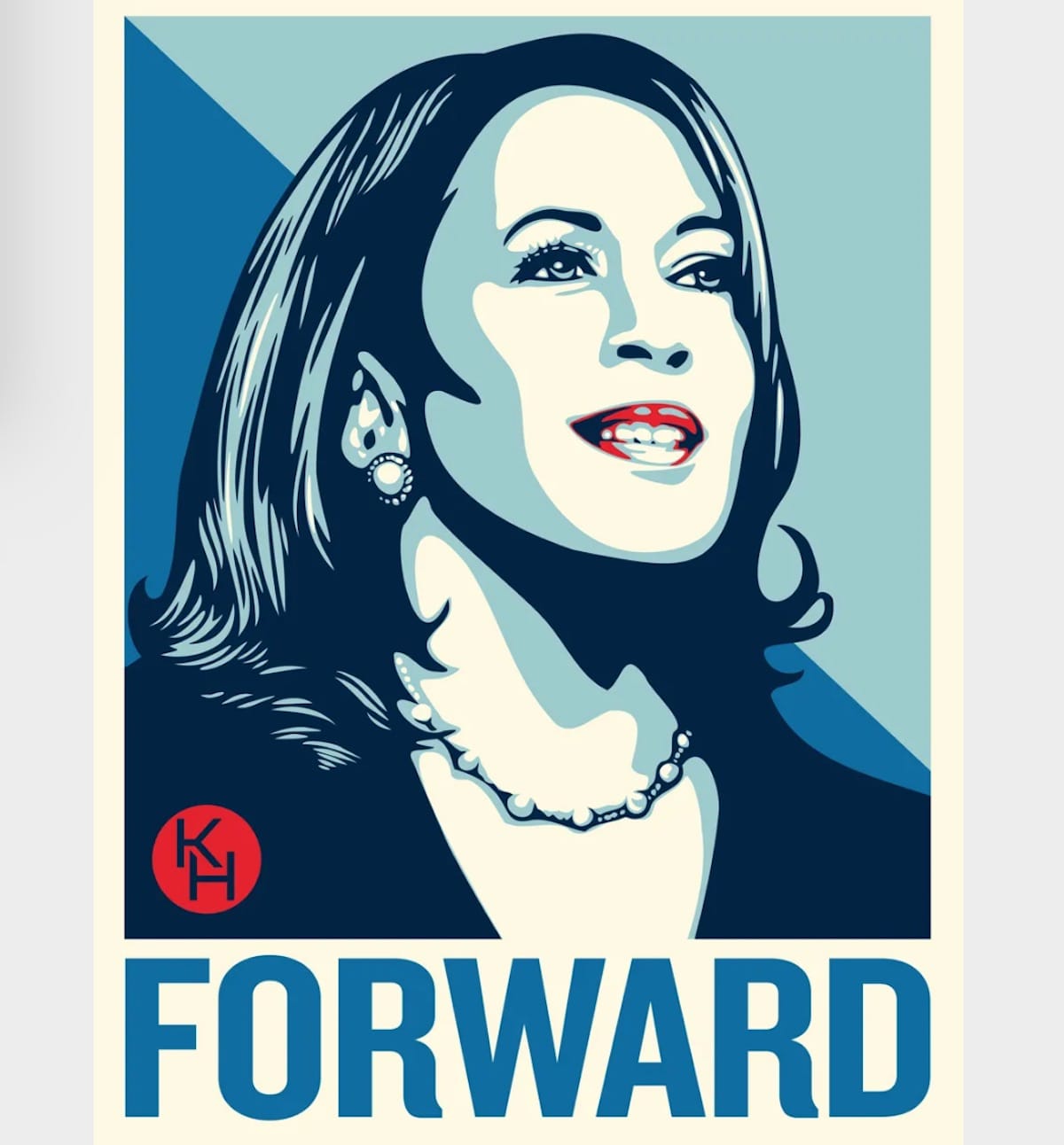
Shepard Fairey is back, but this time the impact that Obama had with his poster is now absent. The combination of Harris’ wistful look and odd, arguably uncanny, smile does not convey seriousness in the way that Obama did. It feels more as though she has seen someone that she vaguely recognises at a party and is offering acknowledgement. Not only that, but the slogan this time around, ‘Forward’, is trivial. With a word like ‘Forward’ you make the viewer ask themselves ‘forward from what?’ Biden’s term in office was lack-lustre at best, and this creates the perception that Harris will simply be ‘Biden 2.0’, which is really not the case in other areas of her marketing, and it certainly will not be a selling point for the American voter. All this poster does is remind you of the Obama poster and you think to yourself, ‘Do you remember the Obama years? They were decent.’, rather than making the viewer say to themselves, ‘I bet the Harris years will be good.’


