Form before f(x)
Lily Le reviews the Designs of the Year
After marching through the tourists packing Tower Bridge, I was worried that the Design Museum might be hidden amongst the cafés and small shops of the narrow brick walkways lining the riverside. Of course, it wasn’t. Bright, white, shining at the end of, rather than part of, a shadowy almost-alley, it is a building that exudes contemporary, minimal, and understated.
The Designs of the Year show is displayed in a single room which greets you with a yellow interior and block writing. Think... the shininess of Westfields in a museum. Perhaps the exhibition’s venue, a centre devoted to design, makes one more aware of its own layout. Although it is no different from galleries in the Tate or Barbican you are instantly more aware of where you tread even before the exhibition begins.
The competition, run by the museum itself, is separated into seven categories. It is categorised by themes which link certain designs rather than by functional category. These include the way in which design communicate meaning, the manipulation of science and technology, the invitation to question and interact; also colour, function, and memory.
On show were nominees and winners. All are real-life designs and include the familiar such as the revamp of Exhibition Road, the Shard, and the Olympic Cauldron.
Some designs were interesting, but hardly mind-blowing. Stop, stare, an utterance of “oh” and onto the next. Others seemed downright bad. For some reason the furniture section consisted of many uncomfortable looking, stiff chairs scattered around the place made from anything from wood to plastic, metal rings to iron spikes, and bits of driftwood.
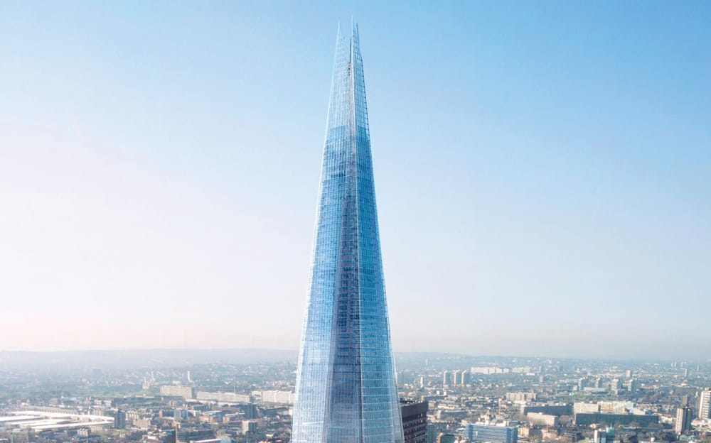
Nevertheless, many were intriguing and invited discussion, debate, and sometimes admiration. A number of the architectural designs fell into this category. They all displayed that contemporary and modern vibe emanating from the Design Museum itself.
A particular highlight was the Book Mountain in Spijkenisse, Netherlands which is exactly that – a mountain of books which form a library. Wooden frames reference the barns of the local agricultural heritage and its homage to oversized, majestic landscapes serves as a nifty visual advert for reading. Unfortunately, it is rather far for a quick visit and so the Clapham One Library is probably a more realistic destination. It was difficult to completely appreciate its design due to only a couple of photos and a small-scale model on display. But the mosaic-like pattern of the placing of the windows had me at first glance.
My favourite category was the product designs. It was full of the most innovative and original ideas. For example, faceture vases, which due to their handmade production process, were all totally unique. Coloured resin is poured into a plastic mould which slightly reshapes it as it cools, and when the mould is peeled away the triangular patterns stick out at different angles which reflect light or form shadow emulating the effect of pixels on an image. Its style, although dated, defines our digital era – in a vase, who would have thought?

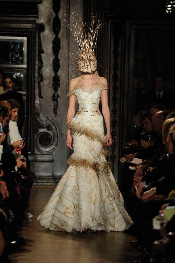
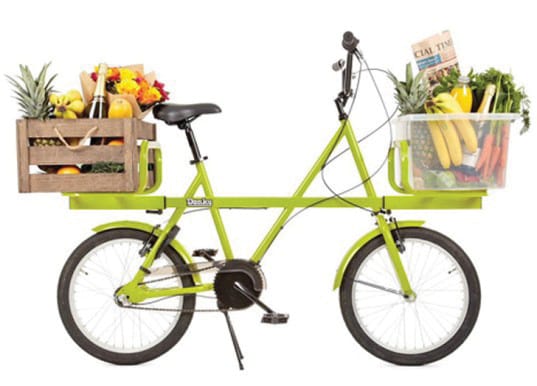
Not knowing much about cars and bicycles, it was difficult to decide what to think about several of the transport entries. Chainless bicycle and cute small car? Sound good to me I guess. What was an obviously excellent idea though was the Air Access wheelchair which can slot into an aeroplane seat frame which prevents disabled passengers from having to be lifted onto stationary seats. The fashion and graphics entries were slightly disappointing. The former included collections from well known names such as Giles Deacon, Comme des Garcons, Louis Vuitton, Prada, and Proenza Schouler but I failed to see the reason for their nominations above anything else. Alexa Chung for Madewell will do for me thanks.
For a similar reason, none of the graphical exhibits struck me as particularly innovative. Everyone is aware of that chunky minimalist font on a plain fuss-free background, used just about everywhere is slightly arty and modern. It was certainly used just about everywhere in these entries. The most interesting feature in this category was the rebranding of Australian cigarette packets. Identical, plain and plastered in ugly health warnings, the brands are given a small space to print their name on an olive coloured background (apparently the least pleasant colour to see on a design). It is supposed to demote brand loyalty (and obviously put everyone off cigarettes) but most interesting is its demonstration of design in controlling consumer behaviour.
This time the tools are in the hands of the government for the sake of public health, treading on the toes of design freedom. What cultural implications will this have?
You may have noticed that I haven’t mentioned any of the winners, the overall victor was chosen from the digital category.
I am not going to tell you but I will tell you what it was not. It was not the Windows Phone 8 app which allows mobile devices to communicate by birdsong. Neither was it a lightfield camera that allows users to manipulate the focus of the fore and background of photos after they have been taken. I would suggest a visit to the Design Museum to find them out for yourself. While debating whether the winners are worthy, the significance of design comes to life. In an age where we have the luxury of not having to compromise between aesthetics, function and trends, we forget about the designs of products, which we live around and base our worlds on. It is a brilliant idea to remind us of the importance of design by celebrating some of the best examples in an immersive public forum.
The Design of the Year awards run at the Design Museum until June 07. Ticket prices around £12.

