The fourth plinth shortlist proves a mixed bag
The Fourth Plinth shortlist is on at the National Gallery until 26th March
Trafalgar Square’s Fourth Pinth is a temporary pedestal upon which the best, edgiest, and most relevant contemporary sculptures are displayed, and the latest spot is now up for grabs. Well, to one of the five shortlisted entries, that is. These are currently up for display (in miniature-sized versions) in the National Gallery, and it makes for an exhibition well-worth perusing, before heading upstairs to drool over the Monets and Van Goghs.
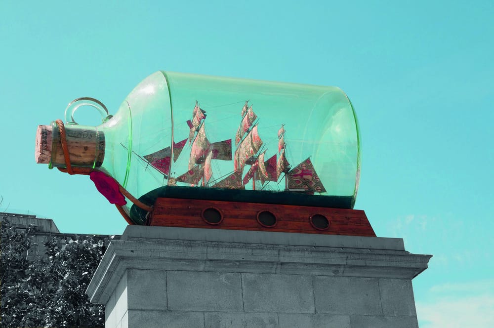
Having housed a diverse and generally eye-catching statuary in the past – including a skeletal horse, a torso-bust, a rocking horse, and even a big blue cock – the plinth currently supports David Shrigley’s giant ‘thumbs-up’ sign, something I suppose most London folks have come across at some point of time. It is a sardonic, sarcastic gesture, meant to mock – among other things – Brexit, and stands tall at a lofty 23 feet.
The new entries are each unique in their own way. First among these as you enter the gallery is a piece from the Raqs Media Collective entitled The Emperor’s Old Clothes, a massive empty robe that is meant to invoke the ghost of the British Empire. It is described as a ‘warning for the future’, and raises all sorts of questions about power and those who have wielded it. The robe is delicate and billowy, forming a beautiful work of art as well as a cautionary symbol, and the message is short, simple, and hard-hitting. Among the various gallery-wanderers that I chanced to speak to, it was the most popular, and I can see why – it is elegant, aesthetic, and harkens back to the values of an art form that died out with the birth of contemporary sculpture. Perhaps it is too old-fashioned, and in this way risks subverting its own message, appearing more like nostalgic yearning than subversion and progress.
The next in line (as per my arbitrary ordering) is Michael Rakowitz’s The Invisible Enemy Should Not Exist, a depiction of the Assyrian winged-bull deity that stood at the entrance to Nineveh, and was destroyed by ISIS at Mosul museum. This version will be made out of Iraqi date-syrup cans, representing an industry that withered away due to the Iraq wars. It is a colourful, exotic piece, and I see the appeal. Meant to ‘carry on…Nineveh’s past’, the sculpture hopes to eventually move to Iraq for a permanent home. So why London? Why Trafalgar Square? To me, it seems a little out-of-place, and I rack my brains to see how it represents London’s vibrant, modern, and metropolitan vibe. It is a little too PC, a little too contrived (made out of date-syrup cans for added symbolism?), and a little too tame for my tastes.
Speaking of tame, the edge returns with Heather Phillipson’s The End, a giant glob of cream with a cherry on top and a fully-functioning drone on top of said cherry. Yes, a drone. On a cherry. On a glob of cream. Oh, and a stray fly, perched atop this monstrosity. There is definitely something sharp and satirical about this piece, and feels more in line with the spirit of contemporary London; it reflects the social uncertainty and political instability of not only the British Isles but the world entirely, and the general unease over government and surveillance that has become almost one of the defining characteristics of our generation. I can definitely see this one winning — and the general underground susurrations (and betting odds) suggest that it will. Don’t hold me to it though. It may prove to be too edgy, lacking the gentler aesthetic sensibilities of some of the other works.
The last two are Damián Ortega’s High Way and Huma Bhabha’s Untitled, the former of which is a truck stacked with oil cans, scaffolds, and ladders. It looks precarious, and is meant to suggest imbalance and instability – again, probably another general political comment of some sort. Untitled – the go-to stereotype for hipster/’modern’ art – is a brown, nearly-shapeless block of cork and polystyrene. Apparently it harks back to sci-fi and comic book symbolism. Apparently it ‘connects’ to African art, Picasso, and Rodin, among others. Alas, I am not sure of the aesthetic value of this work, nor the message it hopes to convey. Thanks to this, High Way is only the second-most unconvincing piece among the five.
I won’t mention who I voted for (yes, the public can ‘vote’ on their favourite and their comments are even ‘taken into consideration’!) because I don’t want to influence my esteemed readership any more than I have already. But I will recommend a visit to this small but thought-provoking exhibition (I’ve been twice already) to make up your mind for yourself.

