Art on the Underground: contemporary tube maps, iconic designs, and giant egg invaders…
Heather Phillipson’s egg-based installation at Gloucester Road station is only the latest in a series of artistic interventions from Art on the Underground, which draws inspiration from the tube network’s history of iconic designs, from architecture to typography.

Regular users of Gloucester Road tube station may have noticed a rather surreal visitor cropping up last week. The disused rail platform, lying opposite the District and Circle line platforms, has been occupied by a dizzying array of eggs: eggs coming out of shower heads; eggs cracked open by nails; fried eggs lying flush against the floor of the platform, as dark and grimy as a used frying pan. It’s the project of Heather Phillipson, a British artist who works across a wide range of media, constructing dense tapestries of meaning that echo our hyperreal modern life, in which we are bombarded with visual information from all sides.
The installation, my name is lettie eggsyrub, takes up the entirety of the 80m platform, and will occupy the space for an entire year. Phillipson describes the project as “a subterranean disturbance, in which hyper-real, creaturely simulations and analogue counterparts dwarf passengers,” and while commuters aren’t known for being that aware of the world around them – London etiquette demands a rigorous refusal to focus anywhere except your feet/your phone/empty space – the sheer scale of Phillipson’s work makes it hard to ignore.
While the installation is new, the ethos behind it is not. Artists have been making use of Gloucester Road station since 2003, when Cindy Sherman erected ten giant self-portraits; Sherman’s work plays with the question of gender and identity, with Sherman donning nausea-inducing prosthetics to abstract herself into other personalities. Before Phillipson’s work was installed, the arches of the platform framed photographs by Trevor Paglen, looking out over a bucolic English landscape, whose horizon was punctured by squat geodesic domes housing US surveillance equipment. All the projects that have made use of the Gloucester Road platform have been organised by Art on the Underground, a branch of Transport for London (TFL) which uses the tube network as a vast gallery space. The programme was originally called Platform for Art, and was founded in 2000, acquiring its current name in 2007; it’s headed up by a team of curators and producers, advised by a panel including those working in the arts and within TFL, as well as practicing artists.
Since its inception, the programme has allowed artists to create a number of significant works, and changed the way commuters and tourists experience the world’s oldest metro system. One of the most recognisable and frequently-changing interventions is the cover of the tube map booklets, which can be picked up in the majority of station ticket areas. Since 2003, they have been inviting a rotating roster of artists to design the cover, drawing on a range of influences, most noticeably the design of the map itself. The result is a series of artworks that, when collected together, function as a miniature exhibition; Art on the Underground have commissioned some of the most influential artists working today, including Rachel Whiteread, Mona Hatoum, and Yayoi Kusama, who have all brought their artistic trademarks – use of negative space; textile handiwork; psychedelic dots – to the iconic map.
“Imran Qureshi’s map cover draws on the beautiful floral patterns of Mughal miniatures”
I’ve got a couple of favourites from the series: firstly, Imran Qureshi’s All Time Would be Perpetual Spring, which sees the Pakistani-born artist drawing delicate, beautiful floral patterns using the colours of underground tube lines. Taking inspiration from and drawing on the same techniques Mughal artists used to produce exquisite miniatures, Qureshi said his work would help create “a completely new atmosphere and a positive energy,” but it retains an unmistakable sense of violence. The individual segments of flora are surrounded by small splashes – the fly in the ointment that calls to mind spots of blood, and unsettles the gentle image.
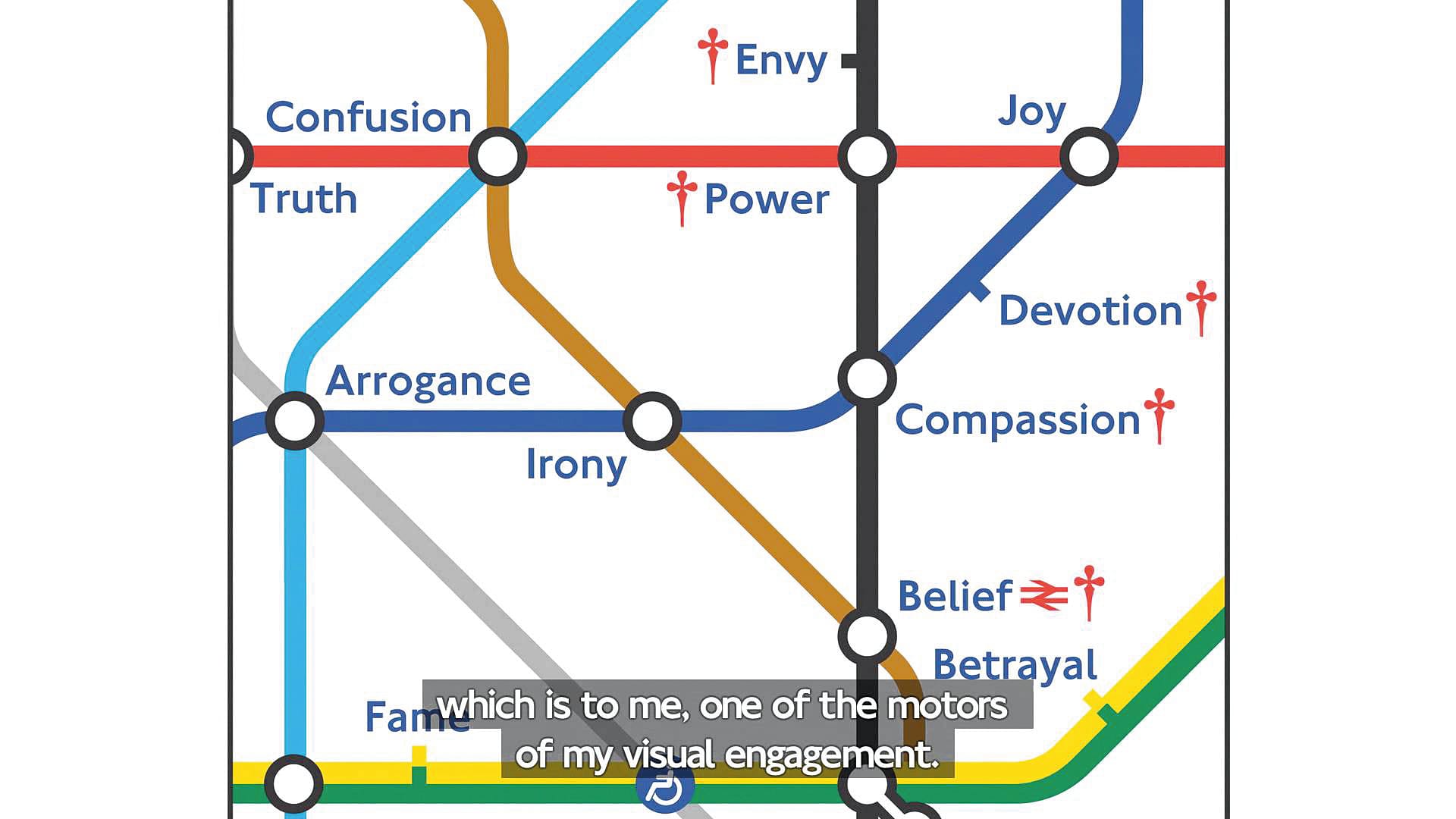
American artist Barbara Kruger, whose work interrogates the meaning of words and language, turned her attention to the tube map cover back in 2010: her version takes a selection of the map around Charing Cross, where the station names have been replaced with totemic values. Waterloo becomes Vigilance; Holborn is renamed Joy; and Oxford Circus takes on Perfection. The result is a witty visual puzzle, that leads the viewer to make links between the different stations: you can take a journey from Joy to Devotion to Compassion, for example, while Fame abuts too close to Pride for comfort. It is reminiscent of Simon Patterson’s fantastic 1992 piece The Great Bear, which saw the tube lines become categories of person – philosophers, scientists, explorers – and the stations individuals through history.

Of course, all these works are themselves drawing upon an iconic piece of urban design: the tube map itself. It can be difficult to imagine the tube map looking like anything other than our current design, but from the foundation of the underground through to the 1930s, transit authorities made use of a geographically-accurate map, which resulted in a massive crush in the centre, tube lines wriggling over each other like vipers, while suburban lines stretched out into emptiness.
It wasn’t until 1931 that things started to get cleaned up. Harry Beck, an engineering draftsman in the London Underground Signals Office, realised commuters didn’t necessarily care about where the stations were in proximity to one another since they’d be travelling underground, losing their sense of direction – instead, they needed a simple topological map, which would tell them how to get from one station to another, and where they needed to change lines. Taking inspiration from electrical circuit diagrams, Beck spaced out the stations so they were equally distant apart, and used only 90 or 45 degree angles within the diagram. The first map, finished in 1931, has a strong resemblance to the modern map we know today – it was easy to read, the extra details had been removed, and the lines had an identifiable colour.
Originally rejected, Beck returned to the drawing board, making small changes to the design, and submitting it again the next year; this time the authorities tentatively went for it, paying Beck £10 for the design, and producing a small run of maps, which were immediately popular among the general public. Over the next thirty years Beck produced maps for the London Underground, which gradually increased in complexity as more lines were added, until an uncredited design led Beck and his employers to fall out; Beck continued to produce maps in his own spare time, but none were produced, and he died in 1974, at the age of 72. It wasn’t until 1997, more than two decades after his death, that his contribution was formally recognised on current maps. Hugely influential, the London Underground map is a work of art in its own right, one that has been emulated by underground networks across the world.
The tube map is just one example of the unified vision of the London Underground network, which branched into all areas of art and design. This unique aspect of the transport network can be traced back to Frank Pick, who started as publicity officer for the Underground Electric Railways Company of London (UERL), a precursor of the London Underground, before becoming its managing director.
Pick introduced a number of key design elements that would become emblematic of the tube, including the iconic roundel – the red ring struck through with a blue bar – which he had Edward Johnston develop from the previous clunky design of a solid red circle in 1913. Pick also commissioned Johnston to develop a signature font for the UERL to use, giving them a clear brand identity. The result, Johnston, was instantly revolutionary: one of the first humanist san-serif typefaces, it would later go on to inspire other designers, such as Eric Gill and Frederic Goudy, and can be seen as a precursor to fonts such as Tahoma or Calibri.
“The vision of the London Underground network branched into all areas of art and design”
Pick’s influence didn’t just extend to visual design, however – he was also commissioned architect Charles Holden to design a number of underground stations, many of which remain iconic to this day. While other transit systems, such as Paris’ Métro, were largely built within a compressed time frame, the London Underground was completed over a number of decades, as new generations and shifting demographics demanded more lines to be opened; the result is a panoply of station design, where a single train journey could take you from Italinante, to art deco, to high-tech.

In total 71 stations have buildings which are listed, while a number of others have entrances or exits within other listed buildings. Holden’s designs, many of which are themselves listed, are among the most iconic – although Leslie Green’s beautiful oxblood tile-clad designs (see Gloucester Road station) come a close second. Holden’s work comes in two main flavours: the first can be seen in the 1926 extension to the Northern Line, with huge plate glass murals featuring the Roundel embedded within a Portland stone facade, and a long awning over the entranceway; the second is found in the later Piccadilly Line extension, with stations made of a series of interlocking shapes – spheres, cylinders, cuboids – that would extend horizontally and vertically. Of these, perhaps the most impressive is Southgate station: circular in its design, it seems to have crashed down on the North London suburb like a UFO, an allusion aided by the Tesla-coil-esque statue planted on top.
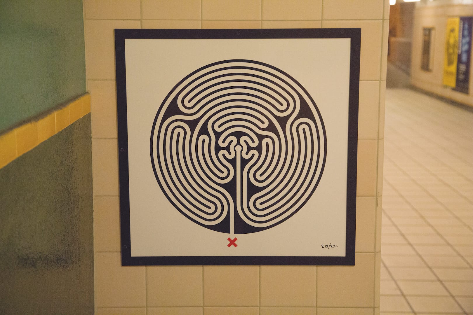
At the centre of Pick’s mission was a desire to bring good design to the average citizen, a project that Art on the Underground keeps up to this day. The variety of the tube network was celebrated in 2013, during its 150th anniversary, with Labyrinth, an installation by Mark Wallinger, which takes the form of 270 unique black and white maze tiles, with one installed at each station. In July 2016, less than a month after the Brexit vote, Art on the Underground launched their #LondonIsOpen series, which invited artists to create works celebrating diversity and inclusion showing how London would remain a global city, regardless of the political climate.
Some may balk at a public institution making a political point in such a way, but the history of the London Underground network shows it has always been a quietly radical force. Anything that brings art down from the gallery space, and into the realm of people’s lives, allowing it to become part of their everyday environment, is in itself political. And so, if you happen to go through Gloucester Road station within the next year, make sure to check out Heather Phillipson’s eggs, and think about how it’s just another step in one of the largest public art projects to have ever existed.


