It’s no Razr, but Motorola are back on the map
Paul Balaji looks at the Moto 360 which the US firm hopes will turn heads this Christmas
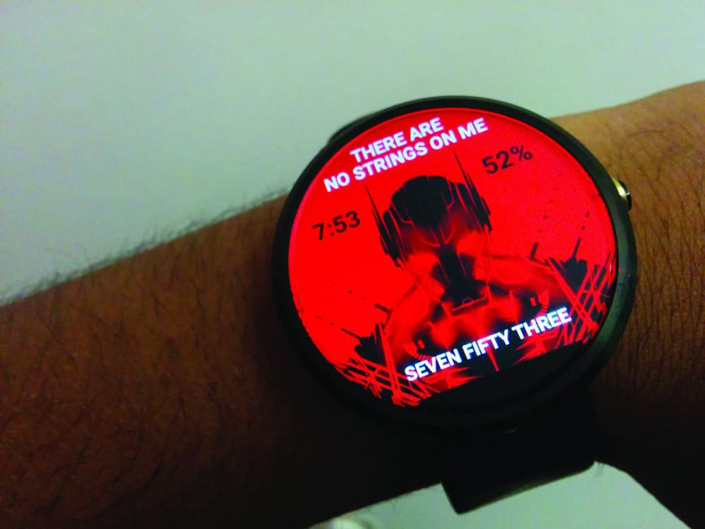
The Moto 360 is one of the first Android Wear devices to launch this year, amongst the LG G Watch and Samsung Gear variants. Sporting a round face and elegant design, it is one of this year’s most highly desired gadgets. At £199 it’s also one of the more expensive, but the combination of Google’s software and Motorola’s hardware make it the smartwatch to buy.
Let’s start with the specs; the Moto 360 has a 1.5 inch LCD circular display, with a tiny bit cropped off to accommodate an ambient light sensor. It has a resolution of 320x290 pixels and is topped off with Gorilla Glass 3, meaning that the screen is tougher and has better viewing angles. An AMOLED display with a higher resolution could have been an improvement, but as it is it’s more than sufficient for checking notifications and running most apps. It has a TI OMAP 3 CPU clocked at 1GHz, 512MB of RAM and 4GB storage. There’s also a pedometer, optical heart rate monitor, dual microphones and Bluetooth 4.0 connectivity. Powering the device is a 320 mAh non-removable battery, which utilises the Qi wireless charging standard.
With a stainless steel body, gorilla glass screen and leather strap, the Moto 360 doesn’t just look like a wearable piece of technology; it’s also a fashionable timepiece. Weighing only 49 grams, it actually feels like a watch when wearing it on your wrist.
The main body only comes in black and silver, but it is possible to buy black, dark grey or light grey leather straps – all of which are interchangeable (if you have a jeweler handy to do it for you). There are also plans to release metal bands soon. The watch is quite sizeable though, coming in at 46mm wide and 11.5mm thick. It can be off-putting at first, but it quickly grows on you after regular use.
The main draw of smartwatches is the software. Although still in its infancy, Android Wear holds up well in day-to-day life. Whenever a notification pops up on your phone, a smaller version is shown on the watch. The icons and text are exactly the same and it’s very easy to respond to messages by simple dictation. Of course the speech recognition isn’t perfect, but it’s good enough for most tasks such as replying to texts and performing Google Now queries.
You could also make use of Android Wear’s voice commands. Writing notes, checking Calendar and even personal navigation are just some of the things you could do right on your wrist.
There’s also a whole suite of fitness apps to track your heart rate and the number of steps you take in a day amongst other things to optimise your exercise experience. The heart rate sensor is quite cool when in operation; pointing green lasers at your wrists looking for signs of life. However, after comparison with a more professional heart rate monitor, I found the 360’s readings to be inconsistent and inaccurate. Nonetheless, it is good enough for use as a rough guide.
Despite having an older CPU setup than its rivals, the 360 runs very smoothly for the most part. Navigating the OS and using various apps proves no problem at all for the watch. An active display is in effect, so simply tapping the screen or pressing the side button will wake the device. The only issue is that there’s a bit of lag for the first split second that the screen is on, but this is only really noticeable after leaving the watch idle for a long time.
The battery life of the watch was very poor initially, barely scraping twenty-four hours. Since then Motorola have released an update that drastically improves the power usage and it now easily lasts more than a day. There’s an ambient screen option that keeps the display permanently on, which would obviously drain more battery. However, since the screen just lights up when you raise your wrist naturally, I haven’t noticed any benefit to this. Even if one’s usage of the watch drains the power quite quickly, the benefit of a small battery is that it can charge up very quickly – depleted to full in less than an hour.
There’s a lot of interesting technology in it, but the Moto 360 is still mainly a watch. It’s been designed with that mantra and it’s great that there’s a huge variety of customisation that can be done to the watch face. The beauty of Android Wear is that you can download a simple app that lets you put on whatever watch face you want. Be it analogue or digital, there’s always some design that will suit you. Even when charging on the wireless dock, it acts as a minimalist bedside clock.
Overall, the Moto 360 is a solid piece of technology. It takes voice commands well, the screen is colourful and the OS is mostly responsive. It packs many features whilst also managing to last more than a day on a single charge. Granted, there are a few issues with the watch, but I’ve never felt dissatisfied wearing it.
To conclude, when judged on its own merit, the Moto 360 is a wonderful device that serves as a great extension to any Android owner.


